
Harmony, Experience, and Well-Being
Color is more than just aesthetics, it’s a powerful tool that influences emotions, decisions, and sensory experiences. Research in color psychology confirms that certain shades can stimulate appetite, create a sense of relaxation, or even enhance the perception of luxury.
In interior design and architecture, this science has become an essential ally for creating spaces that not only look beautiful but also connect emotionally with people.
Every culinary space, a family kitchen, a restaurant, or a bar serves a unique purpose: comfort, engagement, or energy. Choosing the right color palette is a strategic decision that shapes the entire experience. Here’s how to apply color psychology in each scenario.
Family Kitchens: Well-Being and Balance
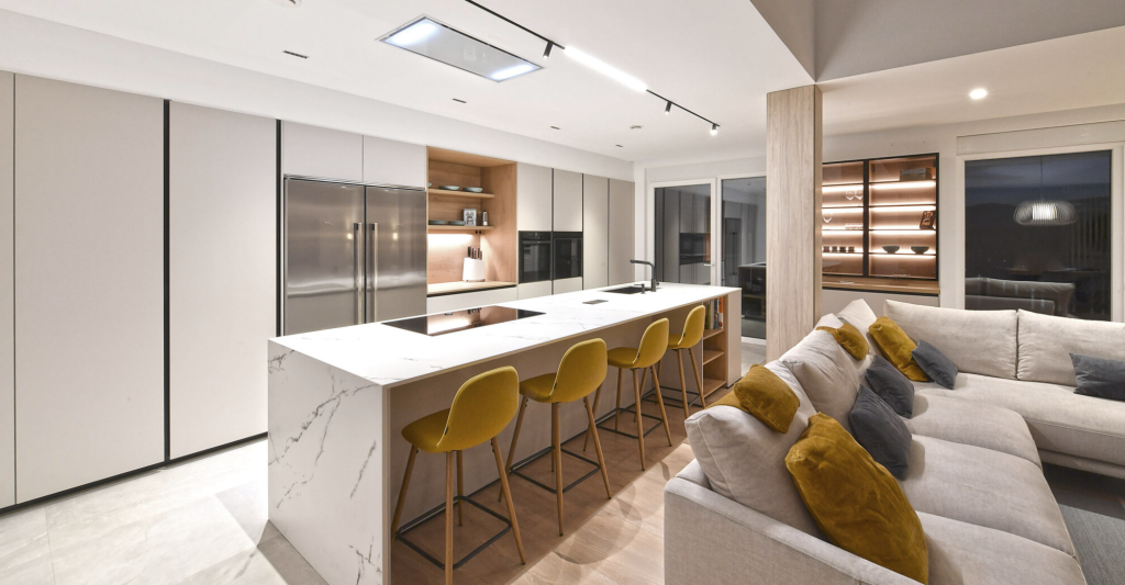
Modern kitchens have evolved beyond mere functionality, they are now the heart of the home, a place for conversation, connection, and creativity. For this reason, the color scheme should promote harmony, cleanliness, and comfort without compromising style.
Best Color Choices for Kitchens:
- White and Neutral Tones: Enhance a sense of space, order, and purity. They’re the foundation of minimalist design, though they can feel cold without warm accents.
- Soft Grays and Beige: Perfect for creating calm, neutrality, and timeless elegance.
- Warm Touches (Light Wood, Sand Tones): Natural materials balance the coolness of neutrals, adding visual comfort and a cozy feel.
- Muted Colors (Sage Green, Dusty Blue): Convey serenity and a connection to nature, ideal for sustainable design trends.
💡 Pro Tip: Avoid overloading the space with too many colors. The goal is functionality and well-being, not visual overstimulation. Reinforce this perception with refined finishes, natural textures, and discreet details.
Restaurants: The Art of Invitation and Retention
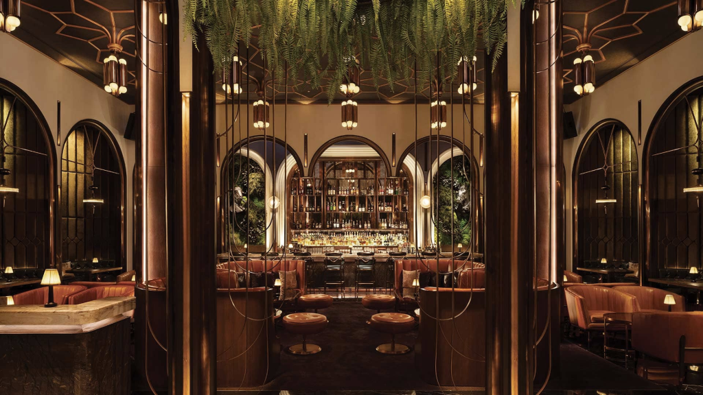
In restaurants, color does more than set the mood, it influences how long customers stay and even how they perceive the menu. Interior designers use strategic palettes to create spaces that invite lingering and enjoyment.
Effective Colors for Restaurants:
- Reds and Oranges (as Accents): Known to stimulate appetite and sociability, but too much can feel overwhelming. Use these hues in upholstery, artwork, or accessories.
- Greens and Earth Tones: Associated with freshness and nature, perfect for health-focused or eco-friendly concepts.
- Black and Gold: Symbols of elegance and sophistication, frequently used in upscale dining spaces, especially with warm lighting.
- Deep Blues: Suggest calm and exclusivity but should be used sparingly as dominant blues can suppress appetite.
💡 Pro Tip: Pair your color scheme with warm lighting to enhance textures and highlight food presentation while avoiding harsh shadows.
Bars: Energy, Dynamism, and Sensory Impact
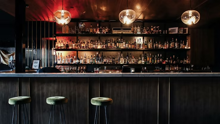
Bars thrive on energy and social interaction, and color plays a key role in crafting impactful, memorable atmospheres.
Best Colors for Bar Design:
- Dark Shades (Black, Charcoal, Petrol Blue): Create an intimate, modern, and sophisticated feel, ideal for high-end lounges.
- Bold Reds and Purples: Add drama and sensuality, especially when used in indirect lighting or architectural details.
- Metallics (Copper, Bronze): Bring warmth and luxury, particularly when combined with dim lighting and organic textures.
- Neon and Vibrant Contrasts: Perfect for contemporary or concept bars that aim to stand out with bold, energetic designs.
💡 Pro Tip: In bar design, color should work alongside music, furniture, and lighting to create an immersive experience. Here, daring combinations can set your space apart.
The 60-30-10 Rule: A Timeless Color Strategy

One of the most effective principles for creating balanced and visually appealing interiors is the 60-30-10 rule. This classic design guideline recommends dividing your color palette into three proportions:
- 60% as the dominant color (walls, large surfaces),
- 30% as the secondary color (furniture, cabinetry),
- 10% as the accent color (decor, accessories).
This simple yet powerful approach ensures harmony and visual interest, preventing spaces from feeling monotonous or overwhelming. Whether you’re designing a modern kitchen, a fine-dining restaurant, or a vibrant bar, applying the 60-30-10 rule can help you achieve a cohesive look that feels both intentional and sophisticated.
Color: A Strategic Design Tool
Color selection is not a mere decorative decision; it’s a strategy that defines emotional impact and functionality. Whether you’re designing a family kitchen, a fine-dining restaurant, or an avant-garde bar, color psychology is a powerful resource for creating harmony, identity, and well-being.
A successful design isn’t improvised. It’s born from conscious planning, aesthetic sensitivity, and the integration of materials and finishes that reinforce your project’s purpose. True luxury lies in the details that last, in beauty that endures, and in spaces that feel alive and meaningful.

